Color is one of the first things users notice when they open a website or app. Before reading text, before clicking buttons, the brain already reacts to color. Research in UI/UX psychology shows that colors influence perception, emotions, and even decision-making, often at a subconscious level. Strategic color choices can improve usability, guide user attention, and increase engagement, while poor color balance can make an interface feel confusing or unprofessional.
Because of this, designers rarely choose colors randomly. Instead, they follow proven principles to create visual harmony and clear hierarchy. One of the simplest and most effective guidelines is the 60-30-10 color rule, a classic design principle originally used in interior design but now widely applied in graphic design, product design and especially in UI/UX.
This ratio helps designers build interfaces that feel structured, readable, and visually pleasing, while also making important elements stand out. By controlling how much each color appears, the 60-30-10 rule reduces visual noise and makes it easier for users to understand where to look first. In this article, we’ll break down how the 60-30-10 rule works in modern UI/UX design, why it’s still relevant in today’s design systems, and how you can use it to create cleaner, more professional interfaces.
Understanding the 60/30/10 Rule in UI/UX Design

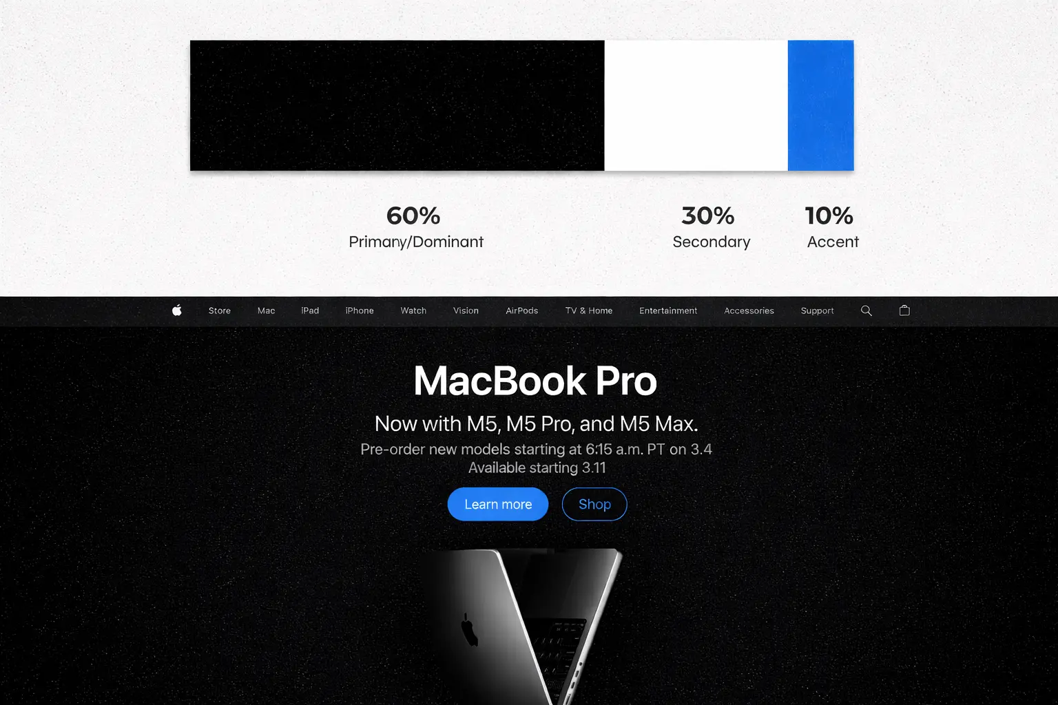
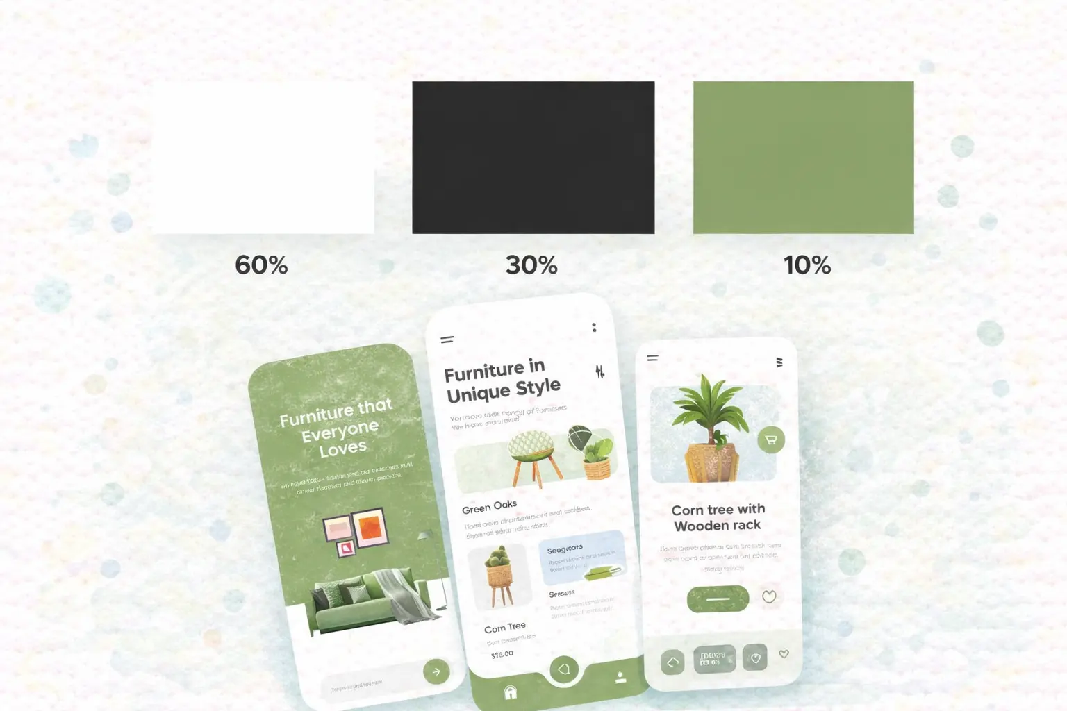
The 60-30-10 rule is a classic design principle used to create balanced and visually pleasing color compositions. The idea is simple: divide your color usage into three proportions so that one color dominates the design, another supports it, and a third is used only for emphasis. This ratio helps prevent visual chaos and makes it easier for users to understand the structure of a layout at a glance.
The rule comes from interior design and traditional color theory, where designers use proportional color distribution to make spaces feel harmonious and comfortable. Over time, the same concept has been widely adopted in graphic design, branding, and UI/UX design, because digital interfaces also need clear hierarchy and visual balance. The rule divides colors into three proportions to create balance: 60% dominant color, 30% secondary color and 10% accent color.
1. 60% Dominant Color:
This is the main color of the interface. It usually appears in backgrounds, large sections, or primary surfaces. The dominant color sets the overall mood and tone of the design.
In many modern interfaces, the dominant color is often neutral, such as white, gray, or dark tones, because neutral backgrounds make content easier to read and reduce visual fatigue.
2. 30% Secondary Color
The secondary color supports the dominant one and adds contrast without overpowering the layout. In UI/UX design, it is commonly used for cards, panels, menus, text, shape, image or section backgrounds. This color helps separate content areas and creates depth in the interface, making the design feel more structured.
3. 10% Accent Color
The accent color is used sparingly to draw attention to important elements. Typical uses include buttons, links, highlights, notifications or small details. Because it appears the least, the accent color becomes the most noticeable. This is why many design systems reserve accent colors for CTA (calls-to-action) and interactive elements, guiding users toward what they should do next.
In UI/UX design, the 60-30-10 rule is not a strict formula, but a practical guideline that helps designers keep color usage consistent, intentional, and easy for users to understand.
Why the 60-30-10 Rule Works
The reason the 60-30-10 rule works so well is not just because it looks good, but because it follows how the human brain naturally processes visual information. When users open a website or app, they do not read everything in order. Instead, the brain scans the screen quickly, looking for patterns, contrast, and clear points of focus. A balanced color distribution helps users understand what is important without thinking too much.
One of the key principles behind this is visual hierarchy. Visual hierarchy means arranging elements in a way that guides the user’s attention from the most important part to the least important part. According to research from the Nielsen Norman Group, strong visual hierarchy helps users complete tasks faster and reduces confusion because the interface communicates structure before the user reads any text.
The 60-30-10 rule naturally creates this hierarchy. Because the accent color appears less often, the brain immediately notices it. This makes it perfect for buttons, links, and important interactions. When too many colors compete for attention, users may feel overwhelmed and take longer to decide where to click. Studies in color psychology show that limiting the number of strong colors reduces cognitive load and improves usability, especially in digital interfaces where users must make quick decisions.
Another reason the rule works is related to contrast and predictability. Humans prefer layouts that feel organized and consistent. When one color dominates the screen, the design feels calm and controlled. When a smaller color is used for structure, the layout feels readable. When a tiny amount of bright color is used for highlights, the interface feels clear and interactive. This predictable pattern makes users more comfortable and increases trust in the product.
The same principle is used in many modern design systems, from mobile apps to SaaS dashboards, because it helps designers control complexity while still allowing strong branding. Even when users don’t notice the rule itself, they feel the result, a UI that looks clean, professional, and easy to use.
How to Apply the 60-30-10 Rule in UI Design
Understanding the theory is simple, but the real value of the 60-30-10 rule comes from knowing how to apply it in real interfaces. In UI/UX design, the rule does not mean counting pixels exactly. Instead, it means controlling how much visual space each color occupies so the layout feels balanced and easy to scan. Designers use the rule as a guideline to decide which color should dominate, which should support, and which should attract attention. Below is how the rule is typically applied in UI design and how you can implement it in Figma.
Below is how the rule is typically applied in UI design and how you can implement it in Figma.
1. 60% Dominant Color (Background & Main Surfaces)
The dominant color should cover most of the interface.This color creates the overall mood and provides a neutral space for content. Common uses for the 60% color:
In Figma, the dominant color is usually defined as a Color Style for backgrounds.
Example:
2. 30% Secondary Color (Structure & Separation)
The secondary color supports the dominant one and helps divide the layout into clear sections. It should not compete with the dominant color, but it should be visible enough to create contrast. Common uses for the 30% color:
Many designers choose a softer brand color, a darker/lighter neutral, a tinted background or a surface color. You can create additional Color Styles in Figma such as:
3. 10% Accent Color (Action & Attention)
The accent color is the smallest but most important part of the rule. This color is used to draw attention to key actions and important information. Common uses for the 10% color:
How to set this in Figma: Create Accent color styles:
How to Choose Colors for the 60-30-10 Rule
Knowing the ratio is only the first step. The real challenge is choosing the right colors that work well together while still following the 60-30-10 rule. A good color combination should feel balanced, readable, and consistent with the brand. If the colors are chosen poorly, even the correct ratio will not make the interface look professional. Designers usually start with a base color system, then assign each color to the 60%, 30%, or 10% role.
1. Start with the Brand Color
In most UI projects, the brand color is the starting point. However, the brand color does not always need to be the dominant color. In many modern interfaces:
Brand color → Accent (10%)
Neutral color → Dominant (60%)
Soft variation → Secondary (30%)
This approach keeps the interface clean while still showing brand identity. Example:
- White background → 60%
- Light gray cards → 30%
- Blue brand button → 10%
This is why many SaaS and product websites use neutral layouts with a strong accent color for actions.
2. Use Neutral Colors for the Dominant Area
Large areas should usually use neutral colors, because strong colors over large surfaces can cause visual fatigue. Common dominant colors:
- White
- Light gray
- Dark gray
- Soft beige
- Very light brand tint
Neutral backgrounds make text easier to read and allow accent colors to stand out more clearly. Many modern design systems recommend using neutral surfaces for most of the layout to improve readability and accessibility. High contrast between text and background is one of the key factors for usability, especially for long sessions or data-heavy interfaces.
3. Choose a Secondary Color That Supports, Not Competes
The 30% color should create structure, not distraction. Good choices for secondary colors:
- darker/lighter version of dominant
- soft brand tint
- muted complementary color
- surface color from design system
Bad choices:
- too bright
- too saturated
- too close to accent color
- too similar to background
The secondary color should help separate content areas without stealing attention from important actions.
4. Use the Accent Color Carefully
The 10% color is the most powerful color in the interface. Because it appears less often, the brain notices it faster. That is why accent colors are usually used for:
- Primary buttons
- Links
- Active states
- Notifications
- Important icons
- Selected items
According to usability research from Nielsen Norman Group, clear visual emphasis helps users understand where to click and what to do next, which improves task success and reduces confusion. Good accent colors usually:
- have strong contrast with background
- match brand identity
- are used consistently
- appear only when needed
If accent color is used everywhere, it stops being an accent.
5. Use Color Tools to Build Better Palettes
Designers rarely pick colors randomly. They often use color tools to create balanced palettes. Common methods:
- Monochrome palette
- Complementary colors
- Analogous colors
- Neutral + brand + accent
- Light / dark / highlight
Popular tools:
- Adobe Color
- Coolors
- Material color system
- Tailwind color scale
These tools help create colors that feel harmonious before applying the 60-30-10 ratio.
Common Mistakes When Using the 60-30-10 Rule
The 60-30-10 rule is simple, but many designs still look unbalanced even when designers try to follow it. This usually happens because the rule is misunderstood or applied too literally. The goal of the rule is not to measure colors exactly, but to create clear visual hierarchy and harmony. Below are the most common mistakes designers make when using the 60-30-10 rule in UI/UX.
Mistake 1: Using Too Many Accent Colors
One of the biggest problems in UI design is using multiple highlight colors at the same time.
For example:
- Blue button
- Green button
- Orange link
- Red notification
- Purple icon
When too many colors compete for attention, users don’t know where to look first. Accent color should be limited because its purpose is to guide attention. If everything looks important, nothing feels important.
Good practice:
- Use one main accent color
- Use additional colors only for status (success, warning, error)
- Keep CTA color consistent
Mistake 2: Using the Accent Color Too Much
Sometimes designers choose a strong accent color, but then use it everywhere:
- background
- cards
- buttons
- text
- icons
This breaks the 10% rule. Accent color should be rare. Its power comes from contrast.
Clear visual emphasis works only when important elements stand out from the rest of the interface. When highlight colors appear too often, users need more time to understand the layout.
Good practice:
- Accent color → actions only
- Dominant color → background
- Secondary color → structure
Mistake 3: No Clear Dominant Color
Some interfaces use many colors with similar weight:
- colored background
- colored cards
- colored sections
- colored buttons
This makes the UI feel noisy and hard to scan. The dominant color should cover most of the screen and create stability.
Without a dominant color:
- layout feels messy
- hierarchy becomes weak
- text becomes harder to read
Good practice:
- Choose one main background color
- Keep large areas calm
- Avoid strong colors for full-screen surfaces
Mistake 4: Secondary Color Competes With Accent Color
The 30% color should support the layout, not fight for attention.
Bad example:
- Bright blue background
- Bright green cards
- Red buttons
Now everything looks equally strong.
Good secondary colors are usually:
- softer
- less saturated
- darker/lighter neutral
- tinted version of brand color
The accent color should always be the most noticeable color.
Mistake 5: Ignoring Accessibility and Contrast
Even if the ratio is correct, the UI can still be hard to use if contrast is poor.
Common problems:
- light text on light background
- low contrast buttons
- gray on gray UI
- pastel on pastel
Accessibility guidelines such as WCAG recommend strong contrast between text and background to ensure readability for all users, including users with visual impairments.
Good practice:
- Check contrast ratio
- Test light and dark mode
- Avoid very low contrast combinations
- Make buttons clearly visible
Good color balance is not only about beauty, it is also about usability.
Mistake 6: Following the Rule Too Strictly
The 60-30-10 rule is a guideline, not a mathematical formula.
You don’t need to measure exactly:
- 60.00%
- 30.00%
- 10.00%
Modern UI design often uses variations like:
- 70-20-10
- 65-25-10
- 80-15-5
The important part is:
- one color dominates
- one color supports
- one color highlights
If hierarchy is clear, the rule is working.
Applying the 60-30-10 Rule in Real Projects with Align.vn
Understanding the 60-30-10 color rule is one thing, but applying it correctly in real projects requires experience, especially when working with branding, responsive layouts, and large design systems. In professional UI/UX workflows, color balance is not decided on a single screen, it must stay consistent across the entire product, from landing pages to dashboards and mobile views.
At Align, we use the 60-30-10 principle as part of a larger design system approach. Instead of choosing colors randomly, we define structured color tokens and reusable styles in tools like Figma so every page keeps the same visual hierarchy. If you want to see how we apply these principles in real projects, you can explore our UI/UX and web design services here.
Conclusion: A Simple Rule That Makes UI Design Feel Professional
The 60-30-10 color rule may sound simple, but it remains one of the most effective ways to create balanced and professional UI design. By controlling how much each color appears, designers can guide user attention, improve readability, and make interfaces feel clean and structured. Instead of guessing which colors to use, the rule gives a clear starting point: one dominant color for stability, one secondary color for structure, and one accent color for action.
In modern UI/UX design, the rule is not about exact percentages. It is about visual hierarchy. Whether you are designing a landing page, a SaaS dashboard, or a mobile app, users should immediately understand what is background, what is content, and what is clickable. When color balance is correct, the interface feels easier to use even before the user reads anything.
Today, many design systems, component libraries, and product frameworks still follow this principle, even if they don’t call it the 60-30-10 rule. Neutral surfaces, supporting layers, and limited accent colors are used across modern products because they reduce visual noise and make interactions clearer. Research in usability and visual hierarchy continues to show that consistent structure helps users complete tasks faster and feel more confident when using digital products.
For designers, the best way to use the rule is to treat it as a guide, not a limitation. You can adjust the ratio, simplify the palette, or adapt it to brand identity, as long as the hierarchy stays clear. When one color dominates, one supports, and one highlights, the design will almost always feel more polished.