Here’s a number that should make you sit up: 88% of users won’t return to a website after a bad experience, and poor layout is often the culprit. The grid isn’t a constraint ; it’s the reason professional designs look so put-together. Most designers skip this step. Don’t be most designers.[1]
Grid systems are the invisible scaffolding that transforms scattered elements into cohesive, user-friendly layouts. They bring order to chaos, guide the eye exactly where you want it to go, and make your work feel intentional rather than accidental.
In this guide, I’ll break down what grid systems actually do, walk you through the essential types every web designer needs to know, show you how to build them from scratch, and explore how they adapt seamlessly to responsive design. Ready to transform your layouts from “meh” to magnetic? Let’s dive in.
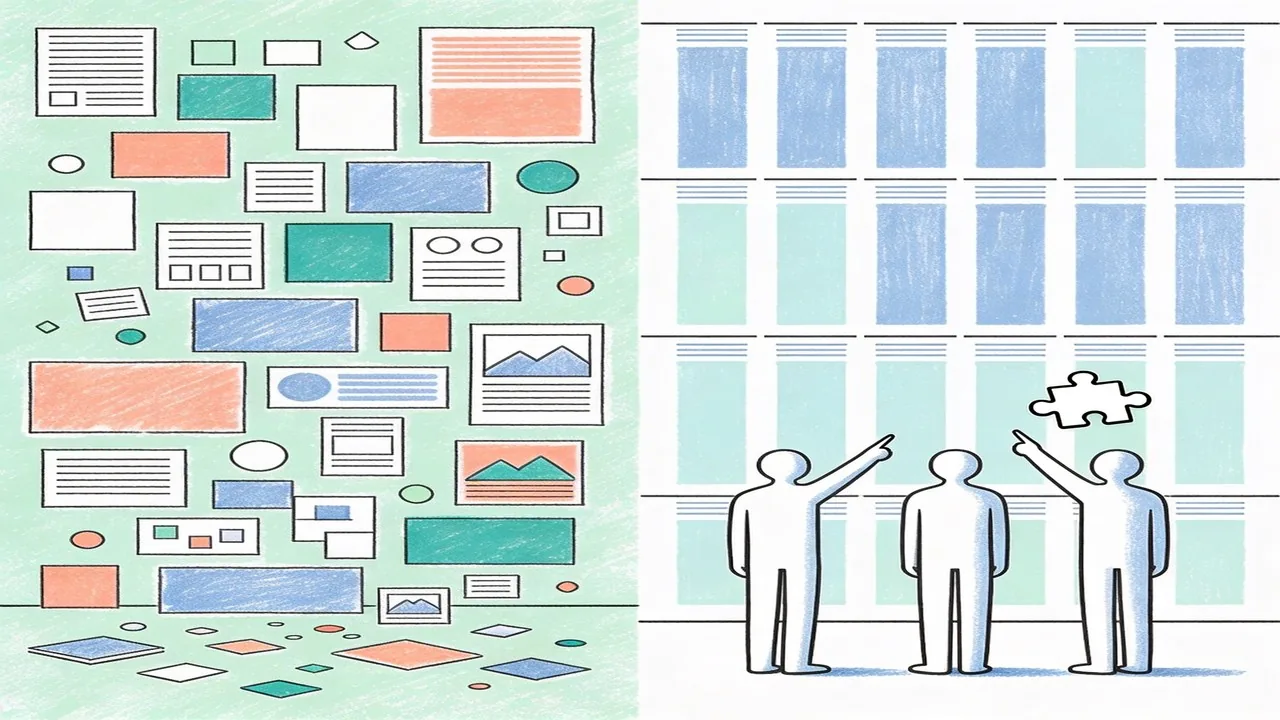
What Are Grid Systems and Why They Matter in Design
A grid system is a structured framework of intersecting vertical and horizontal lines that organizes content into logical, visually harmonious sections. Think of it as the skeleton beneath your design, the invisible architecture that holds every element in place. At its core, a grid consists of columns, gutters (the spaces between columns), and margins, all working together to create a rhythm that feels natural to the human eye.
The concept traces back centuries, but it reached its modern form through Swiss design pioneers like Josef Müller-Brockmann, whose treatise “Grid Systems in Graphic Design” became the definitive guide for using mathematical precision to achieve clarity and order. His work showed that when elements align to a grid, the result feels intentional rather than accidental.
These foundational principles seamlessly transitioned to digital design, though screens introduced new challenges like responsive behavior and varying viewport sizes. The payoff is worth the adaptation effort. Research indicates that consistent visual organization significantly impacts user engagement and comprehension, with users forming opinions about website layouts in as little as 0.05 seconds.[2]
Grid systems create visual rhythm by establishing predictable patterns that guide the viewer’s journey through content. They establish balance, ensuring no element feels orphaned or overwhelming. When done right, the grid becomes invisible to users, yet they feel the calmness and clarity it creates.
The Essential Types of Grid Systems for Web Design
Understanding the different grid types helps you choose the right approach for each project. Let’s break down the three most common systems.
Column Grids and Their Applications
Column grids are the workhorses of web design, dividing content into vertical slices that create structure and alignment. The 12-column grid has become an industry standard, popularized by frameworks like Bootstrap and adopted by Tailwind CSS. Why 12? It offers maximum flexibility since it’s divisible by 2, 3, 4, and 6, allowing designers to create everything from two-column layouts to complex multi-tier arrangements. E-commerce sites frequently use column grids to showcase product listings, while blogs rely on them for comfortable reading columns. When you need consistency and predictability across pages, column grids deliver.[3]
Modular Grids for Complex Layouts
Modular grids add horizontal rows to the vertical columns, creating a matrix of content blocks. This approach works beautifully for dashboard interfaces, news sites, and any application requiring dense information organization. The modules ensure elements align both horizontally and vertically, creating a tidy appearance even with diverse content types. Design systems at companies like Spotify and Airbnb leverage modular grids to maintain coherence across complex platforms.
Hierarchical Grids for Content Prioritization
Hierarchical grids abandon rigid structure in favor of intentional imbalance. They guide the eye through deliberate scale variations and strategic placement, emphasizing key elements over secondary information. This approach shines on landing pages and editorial spreads where you want to control the narrative flow. The key insight is matching grid complexity to your project’s scope. Straightforward sites benefit from column grids, intricate applications demand modular structures, and brand-forward designs thrive with hierarchical arrangements.

How to Build Effective Grid Systems
Now that you understand the different grid types, let’s get practical. Building effective grid systems comes down to three key decisions: column structure, spacing, and constraints.
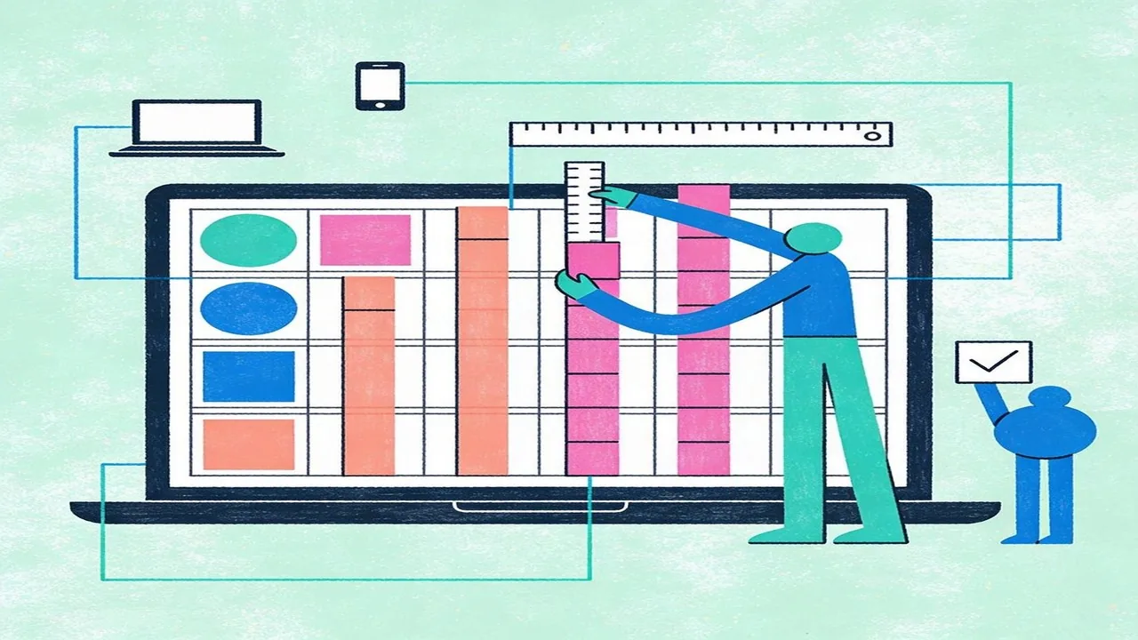
Determining Column Count, Gutter Width, and Margins
For most responsive websites, 12-column grids offer the best balance between flexibility and structure. This divisible number works seamlessly across desktop, tablet, and mobile breakpoints. Gutter width typically ranges from 16px to 32px on desktop, with 20px being a reliable sweet spot. Margins should mirror your gutters on larger screens, creating visual symmetry. According to the Material Design guidelines, maintaining consistent spacing throughout your layout improves usability by up to 20%.[4]
Setting Up Max-Width for Optimal Readability
Line length directly impacts comprehension. Research shows that 45-75 characters per line provides the most comfortable reading experience, which is why most body text feels best around 600-680px wide. For full-width designs, a container max-width between 1200px and 1440px works well, though you might scale down to 960px for more contained content experiences.
Balancing Flexibility with Structural Integrity
The 8px baseline grid remains the industry standard for vertical rhythm. By working in multiples of 8 for spacing (8, 16, 24, 32, 48, 64), you create consistency that feels intentional rather than arbitrary. Your grid systems should accommodate responsive behavior without breaking the underlying structure. Flexible components scale proportionally within their columns, and breakpoints should respect your grid’s logic rather than ignoring it.
Grid Systems and Responsive Design
Mobile now drives the conversation. Mobile accounts for over 60% of web traffic worldwide, which means your grid systems need to function beautifully on a 375px screen before they ever need to work on a desktop display. This is the mobile-first philosophy in action: design for constraints first, then expand.[5]
Mobile-First Approach to Grid Design
Starting with mobile forces you to make intentional decisions about hierarchy and content priority. On small screens, you’re typically working with a single column, which means every element competes for attention. Your 8px baseline grid becomes even more critical here, providing the vertical rhythm that keeps layouts feeling cohesive despite limited horizontal space.
Adapting Grids Across Breakpoints
Modern CSS Grid and Flexbox have fundamentally changed how we handle responsive grid systems. Rather than fighting with floats or relying on heavy frameworks, CSS Grid lets you define both the structure and the responsive behavior in your stylesheet. Common breakpoint strategies typically target 480px for small phones, 768px for tablets, 1024px for small desktops, and 1440px for larger displays. The key is letting your grid columns scale naturally between breakpoints rather than resetting everything at each threshold.
Fluid Versus Fixed Grid Strategies
Fluid grids use percentages or fractional units to create proportional layouts that resize smoothly, while fixed grids maintain absolute widths. Most modern implementations blend both approaches, using max-width containers and flexible column units. This hybrid strategy gives you the best of both worlds: predictable structure at known viewport sizes with graceful scaling in between.

Common Grid System Mistakes to Avoid
Even skilled designers hit these classic grid pitfalls. Here is how to spot and fix them before they derail your layout.
Inconsistent Spacing and Gutter Issues
Gutters that shift unexpectedly across breakpoints create visual noise. Your eye struggles to find rhythm when spacing feels random. The fix: define gutters as proportional values rather than fixed pixels, and test across every device width. A quick checklist item: every container should maintain consistent gutter-to-column ratios throughout your grid systems.
Poor Alignment That Breaks Visual Harmony
Misaligned elements signal carelessness, even when the concept is solid. Elements sitting one or two pixels off feel “wrong” to users, though they cannot always articulate why. Use snap-to-grid features in design tools, and verify alignment with overlay guides. According to research from the Nielsen Norman Group, users notice visual inconsistencies within 50 milliseconds, making precision essential.[6]
Overcomplicating Grids Unnecessarily
Some designers create 16-column grids when four would suffice. Complex grids increase cognitive load without adding proportional value. Start simple and scale up only when your content genuinely demands it. Most websites function beautifully with 12-column grids, leaving room for flexible spanning. Before adding columns, ask whether your design actually needs them.
Quick checklist: Audit gutters across breakpoints for consistency; run alignment checks before calling layouts done; resist adding columns unless content requires them.
Conclusion
Grid systems form the invisible backbone of exceptional web design. They bring order to creativity, ensuring every element serves a purpose and every alignment decision supports the user experience. By understanding column structures, mastering gutters, and resisting the temptation to overcomplicate, you will create layouts that feel intuitive and professional. Remember: the best grid systems go unnoticed by users while quietly guiding them through your content. Start simple, validate your decisions with real users, and iterate as your project evolves. Precision in your grid today translates to trust and clarity for your audience tomorrow.
Need Help with Grid Systems? Partner with Align
At Align, we believe great design starts with solid foundations. Our UX/UI design team brings years of experience crafting pixel-perfect grid systems that balance visual harmony with functional excellence. Whether you are building from scratch or refining an existing layout, we help businesses create websites that feel cohesive and perform beautifully across every device. From strategic planning to final implementation, our web design services transform complex design challenges into elegant, user-centered solutions. Visit align.vn to explore how we can elevate your next project, or contact our team for a personalized consultation. We would love to hear about your vision.
References
- 88% of users won't return to a website after a bad experience (Nielsen Norman Group)
- Google research on how visual design and layout consistency affect user engagement and first impressions.
- Bootstrap 5 official documentation on their 12-column grid system, a widely adopted industry standard.
- Material Design layout guidelines – spacing and grid principles from Google
- Statista reports that mobile devices account for more than 60% of global website traffic, validating the mobile-first approach to grid design.
- Nielsen Norman Group research on user perception of visual inconsistencies, including the 50-millisecond threshold for noticing layout issues.
- Research from Google and Answer Lab showing 94% of first impressions are design-related, with users forming opinions in under a second